PROJECT 01
SPLUNK MOBILE DASHBOARD,ALERT
The team
1 Sr.UX designer, 1 Sr. UI designer, 1 Jr. UI designer, 1 Motion designer
Responsibilities
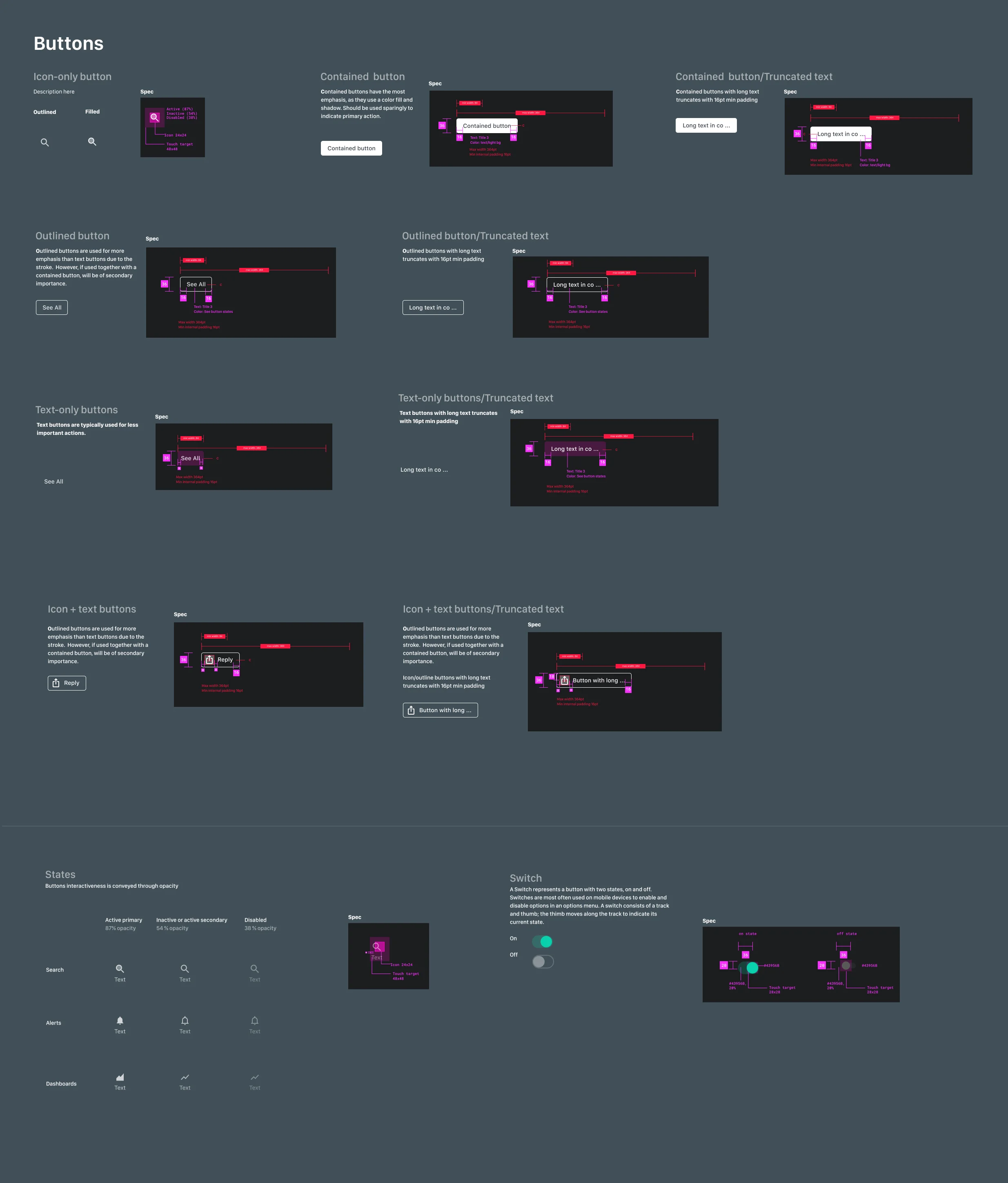
Create an intuitive visual and UI system with design standards for developing applications. Things included guidelines for each component, usages, types, icons, buttons, and screen layouts.
Timeframe
8 weeks from information structure to QA ready
Challenge and user problem
Misleading usage of color
Users get confused by branding green and CTA; green universally means complete, ready for the next step, and positive. But the current design is misleading the non-positive situations.
Design should be Intentional.
Inefficient use of space (macro space)
It takes users longer to scroll to get to the data they seek. Also, cause the user to lose train of mind
NOT designed for accessibility
How to provide complete access to the information for everyone. The current design uses small text, lacks of color contrast, small touch targets (fails for AA GAR level), and lack of talkback labels.